If you are writing online, the Canada.ca style guide will make your writing better, no matter what country you are in.
People are used to working with journalistic style guides, such as those of the Canadian Press (CP) or the Associated Press (AP). These are great resources for journalists, especially to ensure accuracy and objectivity in the words we use.
People “read” differently online
But if you are writing for an online audience, you might need a style guide that accounts for how people read differently online. In fact, people don’t read online. At least, they don’t read until they reach details that they feel they need to carefully digest.
Until that point, they scan.
Fortunately, there is a style guide that was made just for online readers…er…scanners: the Canada.ca Content Style Guide.
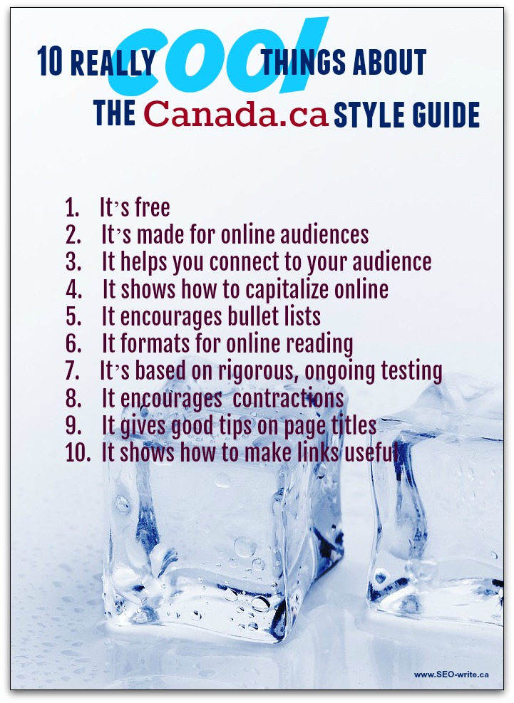
As you can guess by the name, this style guide was developed specifically by the Government of Canada for its relatively new Canada.ca website. Aside from a few Canada-specific references, this is the best style guide on the planet for anybody writing online. Here are 10 cool things about Canada.ca Style Guide.
- It’s a free style guide
- It’s made for online audiences
- It shows how to connect to your audience
- It shows how to capitalize online
- This style guide encourages you to use bullet lists
- It formats for online reading
- It’s based on rigorous and ongoing testing
- The guide gives you permission to use contractions
- It gives good tips on page titles
- The guide shows how to make links useful
It’s a free style guide
If you visited the links I embedded above to the three style guides, you would notice that the CP and AP style guides cost money.
The Canada.c style guide does not. It was developed with Canadian taxpayer dollars to make Canada.ca the most effective website possible. But the government went further than most organizations, making its style guide public for all Canadians to use. And anybody, anywhere can access it for free.
It’s made for online audiences
I’ve already covered this above, but more specifically the guide talks about how to create content that is useful to people. Most style guides just cover word usage.
The Canada.ca guide covers writing principles when writing for a general audience versus a specialized audience. It also covers the principles of plain language writing, including how to structure the content on your page. What other style guide can do that?
As a sneak peak, here are the subsections on plain language:
- Start with the most important information
- Use simple and common words
- Use active voice and positive form
- Use verbs instead of nouns formed from verbs
- Avoid jargon, idioms and expressions
- Use simple sentences
- Use short sentences and paragraphs
- Check the reading level of the content
It shows how to connect to your audience
There’s something you don’t usually see in a style guide. Journalists are trained to write dispassionately about things and about people. Online, you’ll get better results writing to people.
It shows how to capitalize online
This is always a tricky item for style guides. In German, every noun is capitalized. In English, we don’t do that. Well, we are not supposed to, but many businesses capitalize their processes to make them sound more important. And titles of positions get capitalized when they shouldn’t, too.
The Canada.ca style guide gives rules for capitalization. The rules are based on government references, but they are actually a very strong basis for writing about anything online.
This style guide encourages you to use bullet lists
I think this is the coolest thing in the style guide. Few things are harder to read than long-winded sentences that list several things. The longer the list, the tougher to reade. The more words in each item, the tougher to read.
When you use a bullet list:
- It looks like a list.
- Your text is easier to read.
- Your page looks less intimidating.
- Your information looks more organized
The Canada.ca style guide tells us how to use punctuation in lists online, and it is NOT what you are used to doing for offline audiences. It also shows when to use bullets and when to use numbers, which I know confuses some people.
It formats for online reading
People view underlining, bold and italics differently online than offline. And there are other considerations. In this post, I’ve several times broken one of the Canada.ca rules. It’s one I choose not to follow, because I think that italics can be effective when used sparingly.
It’s based on rigorous and ongoing testing
One thing the Canadian government can do, with millions of visits to its website every year, is test plenty of variables. As a result, the style guide is constantly being updated. The updates are aimed at making content as effective as possible. To appreciate this, you have to give up all your prissy ideas of the right way to write. This is something that I have only half done.
For instance, people recognize numbers better online when they are digits than when they are written out…even low numbers like 1 or 2. That’s something I’m prissy about. I’m still writing them the right way. The same goes for writing “percent”, rather than the apparently more effective “%”.
The guide gives you permission to use contractions
Based on all that testing, it turns out people read “you’ll” better than “you will”. Yes! That’s how I write anyway.
But be careful. It turns out that some contractions make reading easier, but others make it harder. Plus, contractions are a matter of your personal writing style.
It gives good tips on page titles
People are always looking for ways to craft better titles. “Better” can mean many things. This style guide will help if you want useful titles that are also good for SEO.
The guide shows how to make links useful
We have a tendency to hyperlink whatever text seems to make the most sense in our paragraphs. But testing has shown that links work better when they:
- support the content of the page they are on
- stand on their own, outside the paragraph
- describe the page we link to
Online style guide for online audiences
You can’t test all the vagaries of the English language to see how online audiences are reacting to them. And you certainly can’t keep up with the rapidly evolving way that people consume information online. But you can access the research that the Government of Canada conducts. It’s all there in the Canada.ca Content Style Guide.
You don’t have to follow every piece of advice. I certainly don’t. But I do follow a lot of it and I have changed many aspects of my blogging and even my writing for clients, based on the guide.
What if you are writing for an offline audience? Here’s a hot tip that most offline publishers haven’t really grasped yet. How we read online is different than how we read offline, yes, but how we read offline is changing. The more we read online, the more our reading habits will change, both online and offline. Watch over the next decade as this reality slowly dawns on offline publishers.
If you write for offline audiences, you can be ahead of the curve by carefully applying some of these online principles to your offline writing, too.


