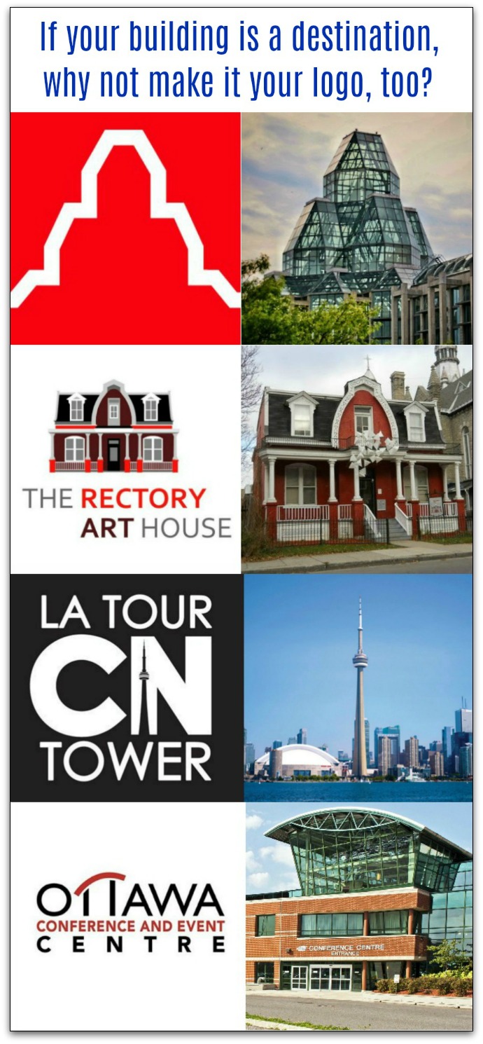
If you have a unique building with a recognizable design, can there be a better logo?
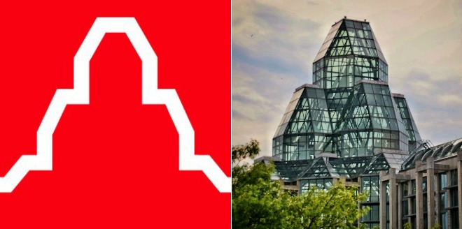
When the National Gallery of Canada’s new home opened in 1988, there was no question that architect Moshe Safdie had created a recognizable centerpiece. At the southeast corner of the building, a towering glass monument rises above everything around, drawing the eye from all corners of the traffic round-about.
It towers above the Great Hall.
In front of the corner tower is a wide space for people to mingle and congregate. On one side is a wide avenue, on the other side a narrow street and a park.
The tower stands out.
That same tower is the museum’s logo.
People can easily identify the logo, because it looks like the museum. People can easily identify the museum, because it looks like the logo.
Every time people see the logo, they are reminded of the building.
Can you use a building logo for your business?
Can you do this for your business? And should you?
The “can” is easy to answer. If your business has its own building, it might already be unique.
Or, you can renovate to add a unique and recognizable feature, such as a clock tower, two-story-tall gates or zig-zag-shaped windows.
If your business is in a strip mall, this is not a great strategy for you. Sorry.
Should you use a building logo for your business?
The next question is whether you should create a logo that points people to your building. While it’s a really cool building, some businesses and organizations are better suited to this sort of branding.
For instance, car dealerships might sound like ideal candidates for building logos. They are big, with plenty of room to build recognizable buildings, and they spend a lot of money on marketing.
But a car would make a better logo at a car dealership. Or even a roadway. Or a green light (traffic light).
The difference between a car dealership and a museum is this:
The car dealership is a transaction centre. The fruits of the transaction are enjoyed elsewhere. So the logo should reflect that.
The museum is a destination or venue. The transaction occurs when entering the building, and the fruits are enjoyed while in the building. In other words, the building is a part of the experience that people pay for. It is part of the product. It is the venue for enjoying the product. A logo that features the building aligns with the product being sold.
What other businesses and organizations are destinations?
- parks
- schools
- theatres
- churches
- museums
- attractions
- restaurants
All of these could be ideal candidates for building-based logos. All they need is some unique architecture and a good graphic designer to create the logo.
Look who uses a building logo
Here are a few sample building-based logos I am aware of.
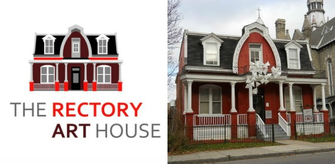
Rectory Art House’s logo is its building
No question, the Rectory Art House is cute. And it’s unique. And everybody who passes by recognizes the building and the logo. But with little marketing, most people have no idea what goes on there. I sure don’t. Art, I suppose.
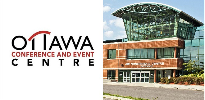
The Ottawa Event Centre’s logo is its signature skylight
The glass-domed skylight covers the central corridor inside the Ottawa Conference and Event Centre. It is the one outstanding architectural feature in an otherwise handsome but far from unusual building. As such, the skylight is its symbol. It is its branding. It is what people see as they approach to recognize that they have come to the right place. So it makes sense that it is also the logo.
Well, sort of. The logo on its wall, barely visible in this photo, resembles the skylight. The logo in use elsewhere, as you can see is more cryptic.
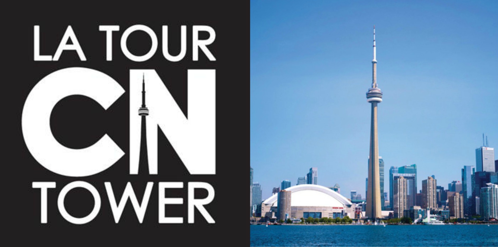
The CN Tower snuck a selfie into it’s logo
No building in Canada is as iconic as the CN Tower, which literally towers over Canada’s biggest metropolis. It’s recognizable from half-way across the city, so why not make a logo out of it?
So many buildings, so many logos
Notice that several of these logos include text, usually in a very stylized fashion. Often words in logos don’t follow grammar rules, and that’s OK. In these cases, the words are all caps.
There are so many building-logos around the world that one could never list them all. I think of the Oriental Pearl Tower in Shanghai. And the Vancouver Lookout. And Le Vieux Chateau restaurant in Hawkesbury. And the One World Observatory in New York City. And the Calgary Tower. And the Bank of Canada Museum. And Le Louvre in Paris.
If your building is central to your customers’ experience, why not make it your logo? Your building will be instantly recognizable to visitors, and the logo will remind them of the great experience they had visiting you.


