
Want more conversions? First you need a credible website. Here are four signs to identify a credible website.
Along the side of a road we pass by frequently, stood a sign: “Flu shot kills.”
The sign was clearly hand-made and the LLs were actually upside-down 77s. It was a Frankenstein sign, put together from pieces found around the yard. For years, it dipped on a slant among unkempt underbrush. In fact, it was in front of a dilapidated house with a messy yard that looked like the scene of those “You might be a redneck…” jokes.
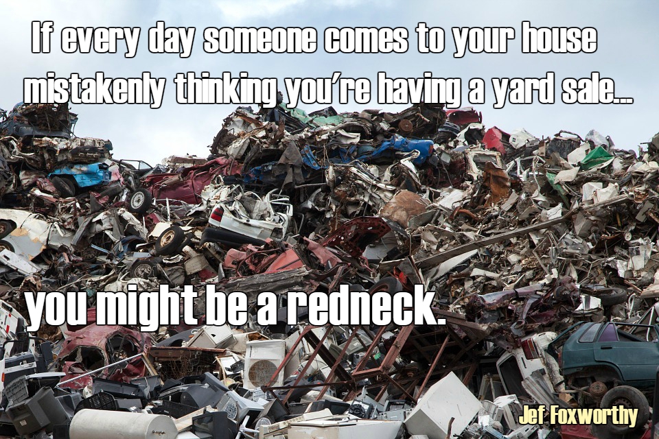
The Flue Shot Kills sign is gone now, but the house, the yard and the mess remain, with new signs about mercy healing and mercy dying.
Nothing about the scene looks professional. The whole thing screams: “Sketchy!”
There are websites like that. Hopefully yours isn’t that bad. But maybe it could use some improvement.
Here are four signs of a credible website – one that won’t scream: “Sketchy!”
The design is clean
There is plenty of room for artistic licence when it comes to website design.
You might have a colour scheme in mind.
You might have a layout type in mind.
There might be design elements you want to incorporate.
All those are good. Any website designer can create the look that you describe, as long as you provide all the information he needs.
But the design has to look clean. It has to look neat, like an office where everything is in its place. It should look the exact opposite of that messy yard, where items are strewn about with abandon.
A cluttered website is just a mess. You don’t look professional. You don’t look credible. Why would anybody risk doing business with you?
People do business with people who look like they know what they are doing. A crisp, clean design sends that message.
A clean design also makes mobile use possible. A cluttered design looks like pure helter skelter on a mobile device.
The words are right
The first thing people do, after looking at your website, is read it. They start with the main headline and work their way down the page.
“Reading” might be too generous a word. Unless they are totally captivated from the first word, they will scan more than read.
The more complex your sentences, the harder it is to read. The harder it is to read, the easier it is to just scan down the path of least resistance.
Bigger paragraphs, more scanning.
Bigger words, more scanning.
Use plain English as much as possible. If you can’t do that well, hire a plain language editor.
And use proper grammar. It’s all very well to use short words and simple sentences, but poor grammar will reflect very badly on you. You won’t come across as professional. You won’t be credible.
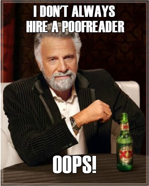
If your words are spelled wrong, you will lose credibility.
If your words are used incorrectly, you will lose credibility.
If your punctuation and capitalization are off, you will lose credibility.
If your English skills are not advanced enough, hire a writer. Or write it yourself, then hire an editor.
The purpose is clear
If your website is designed clean and your writing is good, your purpose should be clear to all who visit.
They should immediately know the topic of your website. By “topic”, I mean the specific topic. “Animals” or “hygiene” is not good enough. They need to know what aspect of these topics you are involved in.
Let’s suppose your website is about animals. What animals do you deal with?
Do you provide information? If so, what type of information, how much do you offer, and for what type of audience?
Do you sell animals?
Do you save abandoned or abused animals?
Do you sell supplies, such as food. Or leashes?
Do you offer veterinary services? If so, where?
People should right away be able to determine if they are most likely in the right place. An obvious purpose will help convert the people who decide they are on the right page.
The path is obvious
Having landed in the right place is a good thing. But what next? Are there clear paths? Are there street signs?
One of the things you will notice on this website is that no matter where you are, the “Get my free quote” button is always visible. No matter where you are, there is a doorway to take action. On this site, the “most desired action” is to complete a query form.
On some other websites, the action is to buy something. Or to give your email address. Or to attend an event. Or to start a chat.
Whatever that most desired action is, make sure there is a clear path to get there. After, all, that’s the point of your website.
Credibility counts!
If you want to sell people anything – a product, a service, an idea, or a free subscription – you have to begin by appearing credible.
First impressions count. The look of your site makes a difference. The words you use make a difference. The purpose and path are also important. A well-organized, intuitive website will increase your conversions, however you define them.


Fantastic advice~!
You know what else causes people to not trust your website? Not having full names on it. How can we take a business seriously if they supposedly have many people involved in it, but not one full name is on the site?
It is more credible to visitors to have some idea who is behind a site. If you put a name on your blog posts, make it a full name and provide a bio to go with it.
Any “business” site that has an about page that doesn’t mention a single person — just their supposed titles — looks fishy.
Gail: I hear you! I want to learn about the individuals behind the company.